Quick analysis 270towin.com's graphic
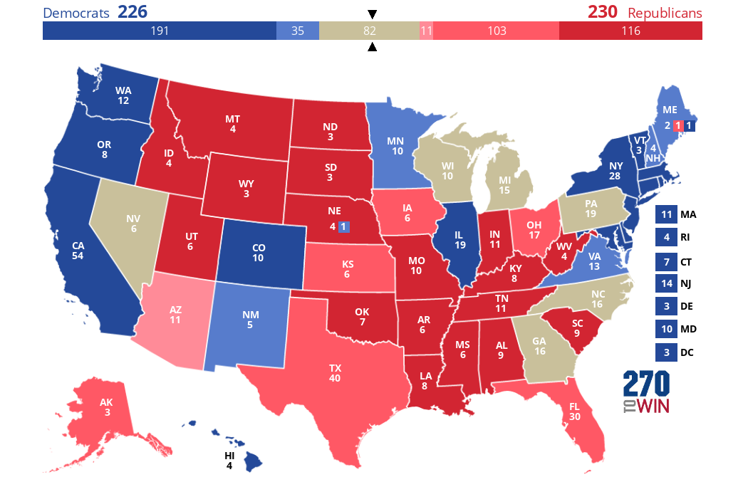
This is an embeded copy of the visual analytics provided on www.270towin.com’s home page. It shows a view of what states are leaning towards which party for the 2024 presidential election. It allows you to click on the states and manipulate the map to try and predict the winner of the election. The data is based on current polling data. Of a few graphics I was able to look up regarding the presidential election, this was the one that was the easiest to understand quickly. It gave me a good idea of who was leading in polling as well as which states were strongly for which party and the states that could be toss-ups. It also shows the amount of electoral votes provided by those states.

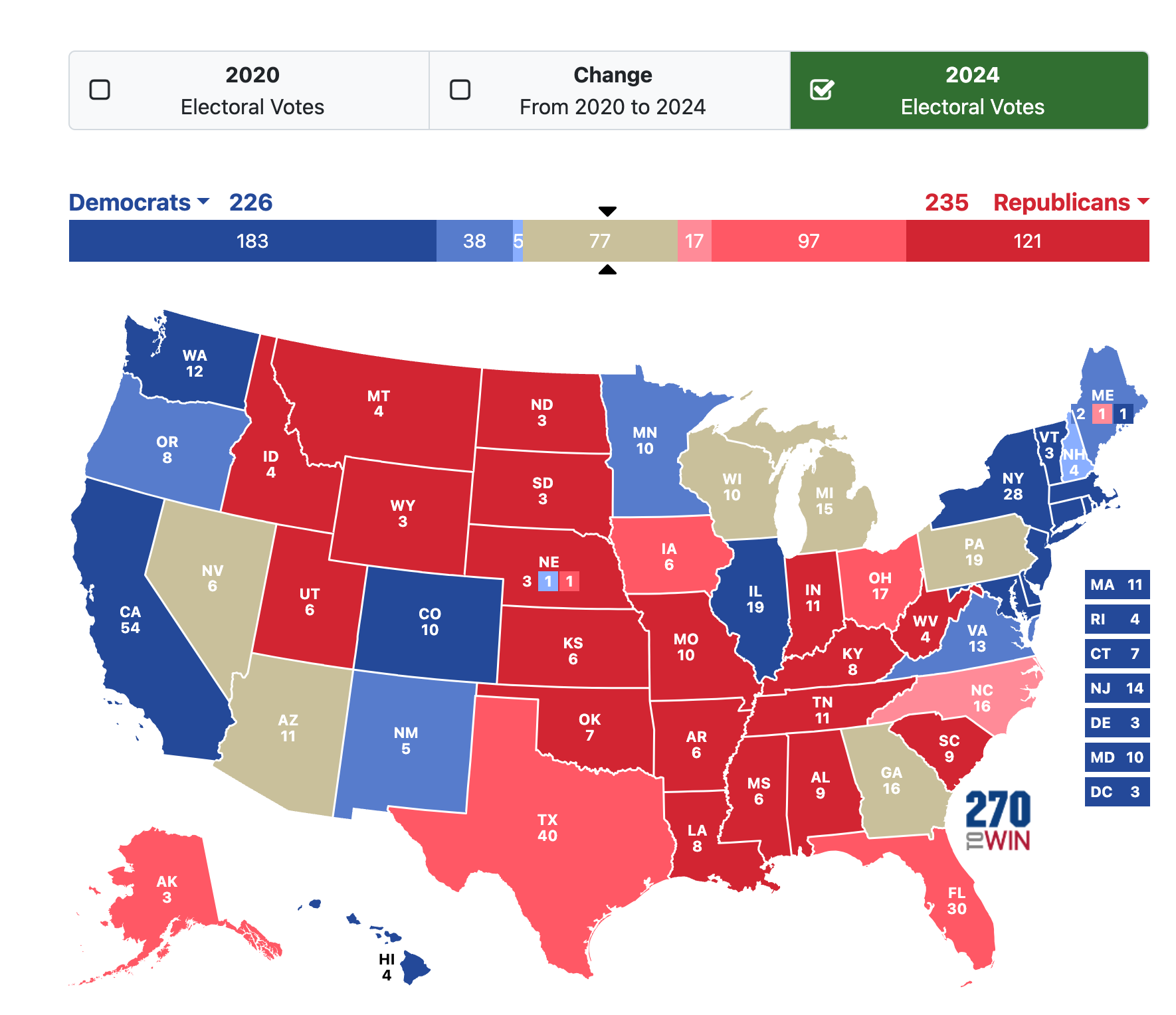
Below is a screenshot of what the graphic looks like on their site vs the above embeded copy.

The screen shot shows the ability at the top to see what the votes were in 2020 and then the change from 2020 to 2024.
I selected this data as it was some recent data that I was interested in. Its data is based on polling data, voters stating they are likely or will vote for a certain party. The model consists of those predicted votes and the electoral votes provided by each state to estimate the likely outcome of the 2024 presidential election. Visually it is clear and easy to decipher as it is a map of the United States.